Use Rhythm, Symmetry, and Hierarchy to Read a Classic Interior
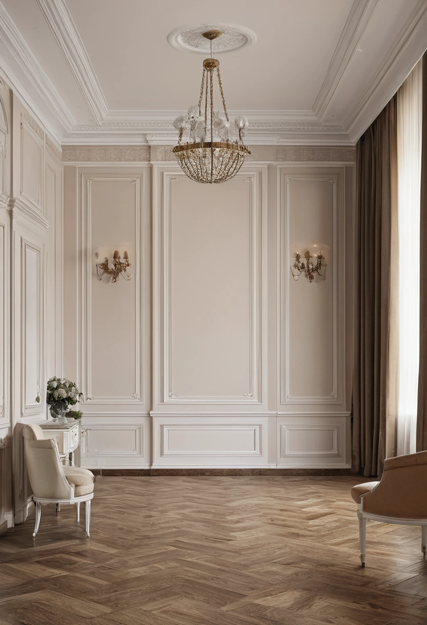
A classic room can feel orderly without having identical objects on both sides. Modenese Interiors presents classical interior design as a coordinated whole; the useful design question is how the eye travels through that whole. Rhythm guides attention through repeated forms, symmetry gives an axis, and hierarchy tells a visitor what matters first.
These terms come from visual design, but they become practical when a room is measured and used. A fireplace may be the focal point while the door sits off center. Repeated wall panels may calm the room even if the furniture is not mirrored. A beautiful drawing can fail if the chair placement blocks a route. Composition needs to work in space, not only on a page.
Find the room's axis before forcing symmetry
Stand at the entrance and look toward the strongest feature: a fireplace, window, doorway, or central wall panel. Draw the line that organizes the view. The Smithsonian Institution Archives' ordering-principles guide defines an axis as a central line that helps organize a design. It also distinguishes symmetry from hierarchy and rhythm. Those terms describe what a design does; they are not commands to make every room perfectly mirrored.
Some rooms have a clear architectural axis but asymmetrical constraints. A window may be offset, a door must swing, or a service passage takes one corner. Arrange major furniture around the strongest useful relationship and use smaller pieces to balance the view. If you add a chair merely to mirror another, ask who will sit there and whether it obstructs movement.
The Metropolitan Museum of Art's Marmion Room account describes repeated pilasters that create visual symmetry in an asymmetrical space. That historic example shows that architectural repetition can organize a room without making its underlying plan perfectly even. It is an observation about a particular room, not a recipe to copy its decorative style.
Use repetition to create rhythm
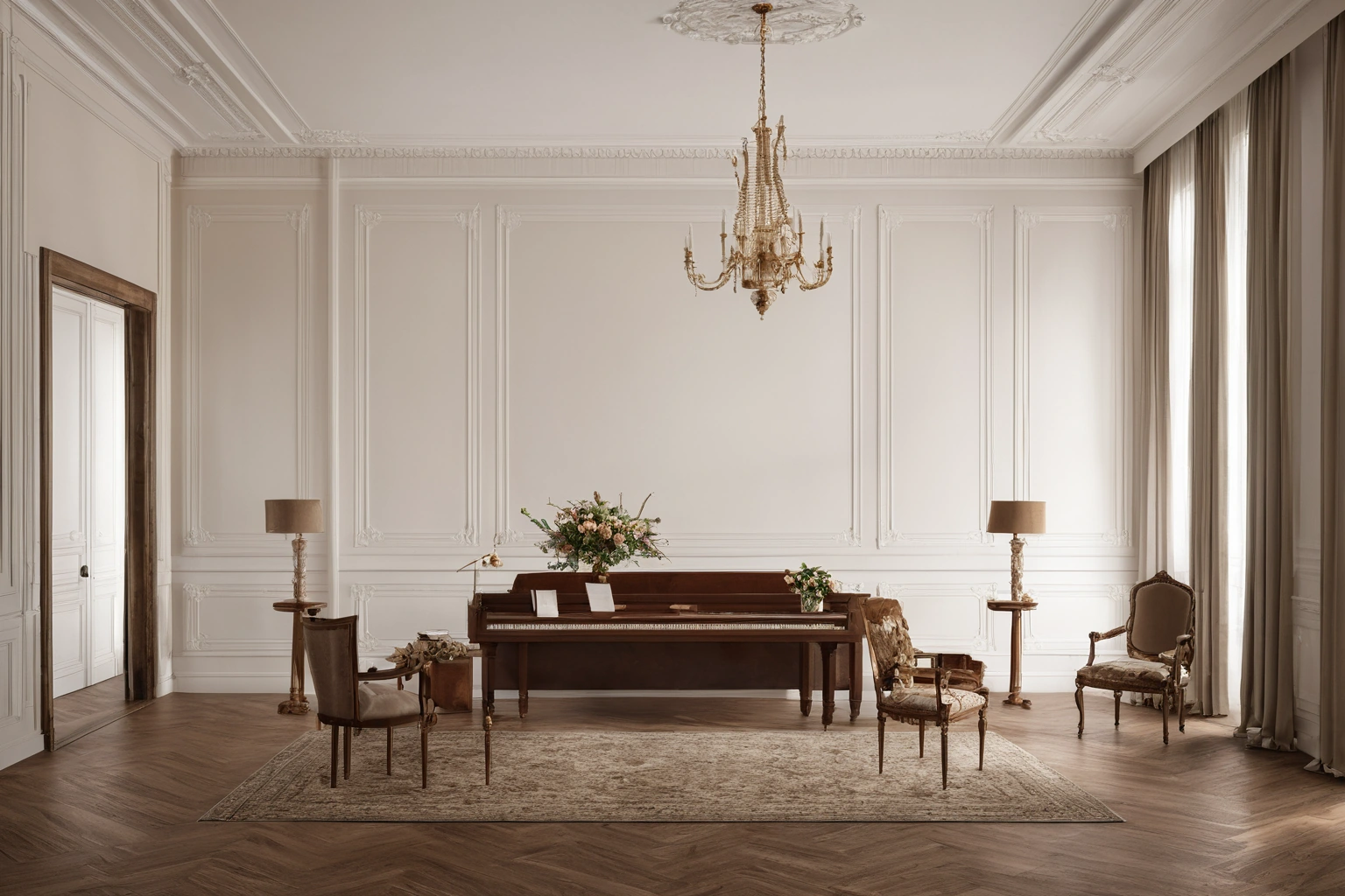
Rhythm can come from a row of wall panels, the spacing of lamps, repeated chair backs, or a sequence of arches. The Smithsonian guide describes it as repeated forms that remain recognizable even when they change. In a room, repetition helps the eye understand a large space as one composition.
Choose what repeats and at what scale. Repeating every detail can make a room stiff; repeating one line or proportion can be enough. A series of panels may share a height while each contains a different object. Chairs may share a silhouette but use two fabrics. Variation makes the rhythm legible because the repeated element remains clear.
Test the rhythm from movement, not only a fixed camera view. A person walking from entrance to seating sees surfaces in sequence. If the first panel is hidden behind a tall cabinet or the final lamp is missing because of a door, the pattern may feel incomplete. Sometimes the best correction is to change the furniture position, not to add another decorative object.
The Met's essay on Georgian interiors explains the historical importance of order, symmetry, and proportion in that tradition. A present-day classic room can use those principles while responding to contemporary functions. The historical source supports the design vocabulary, not a claim that one layout will suit every home.
| Principle | What to look for | Practical test |
|---|---|---|
| Axis | Line from entry to focal feature | Walk it with furniture in place |
| Symmetry | Corresponding forms across a line | Check whether both sides remain useful |
| Rhythm | Repeated panels, lights, or forms | View the sequence while moving |
| Hierarchy | One feature leads attention | Ask what is noticed first |
| Balance | Visual weight feels resolved | Compare the room from several positions |
Give the room a hierarchy
Hierarchy means some elements carry more visual attention than others. The Smithsonian guide says size, color, shape, or location can establish it. In a living room, a fireplace or view might lead, the seating group support it, and small objects finish the composition. If every surface has strong contrast and ornament, the eye has no resting place.
Decide what the visitor should notice first on entering, and what the occupant should notice when seated. These may differ. The entrance might reveal a sculptural wall; the seated position might center on conversation. A good hierarchy can allow both readings. Use lighting to support the chosen order rather than spotlighting every item equally.
Furniture scale can reinforce or undermine that order. An oversized sofa can dominate a modest fireplace. A very ornate table can compete with detailed wall panels. Use measured elevations to compare heights and masses. In a sample room, temporary blocks or taped outlines can reveal whether a proposed piece carries too much visual weight.
Balance visual order with actual use
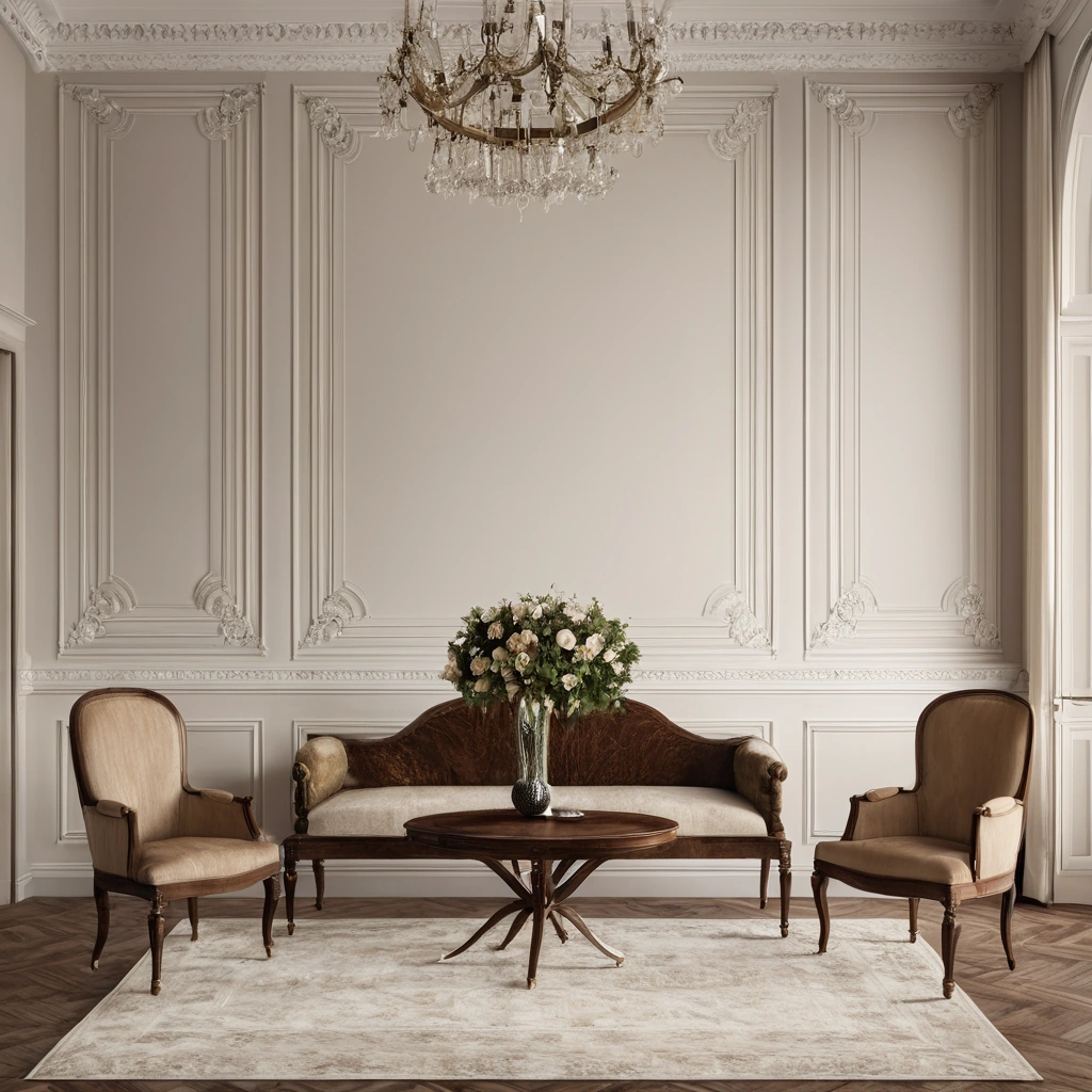
A formal room still needs people to move, sit, and reach surfaces. Leave a direct route from entry to primary seating. Check door swings and the space behind chairs. A mirror-image pair of side tables may look correct in a drawing, but if one blocks a door, the arrangement is not resolved. Balance can be achieved through different forms with similar visual weight.
Consider the room's daily activities. If one corner is used for reading, a chair and task light may sit away from the architectural axis. That does not spoil the composition if the larger rhythm and hierarchy remain clear. The Met's account of the Francis W. Little House living room shows a documented furniture plan with seating clustered around the periphery for reading and conversation. It belongs to a different design tradition, but it illustrates why furniture placement should follow use as well as formal order.
Photographs can mislead. A composition may be arranged for publication and changed for daily life. The same Met account records that the family returned furniture to its preferred arrangement after a photo shoot. A design review should therefore ask whether the plan being approved is a daily arrangement or a temporary image. The answer affects where tables, lights, and clear routes belong.
Test material and light as part of the composition
Rhythm and hierarchy depend on how materials look in the actual light. A glossy surface can pull attention away from the intended focal point. A dark chair can feel heavier than a pale one of identical dimensions. Compare samples at several times of day and under the planned artificial lighting.
Do not let finish coordination become only a color exercise. Wood grain, textile texture, and stone pattern all add visual activity. If wall panels are intricate, quieter furniture upholstery may give the eye a pause. If the architecture is plain, a stronger furniture form can lead. A small materials board beside a measured elevation is more informative than a collection of isolated samples.
Check whether direct light could harm valued materials. The Canadian Conservation Institute's wood-furniture guidance notes that light can change wood and finishes over time. This care consideration does not dictate a style, but it may affect where a featured piece is placed or whether a shade is needed.
Make a final walk-through
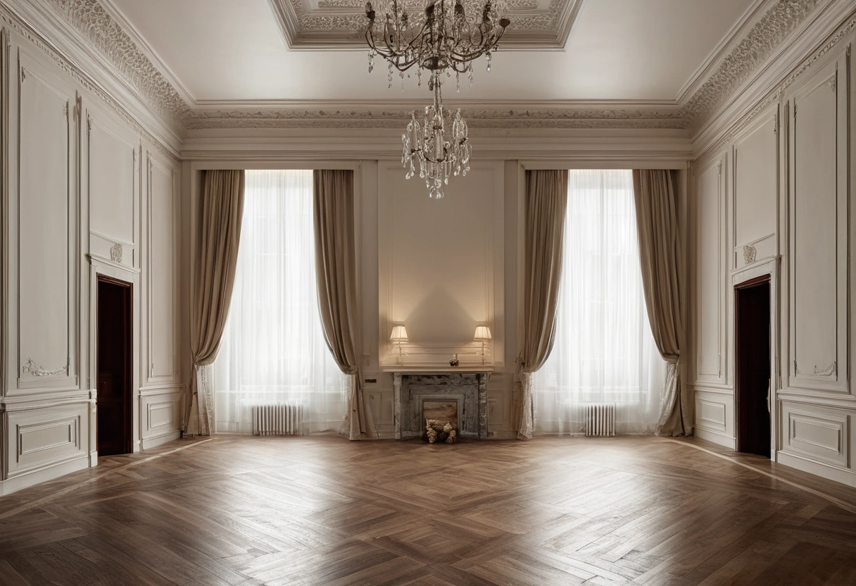
Stand at the door, walk the central route, sit in each major chair, and look back toward the entrance. Note where the eye stops, where repeated forms align, and where the furniture interrupts movement. Adjust one major element at a time and photograph the result from the same positions. This makes the decision visible to the whole team.
A classic interior does not need perfect mirroring to feel coherent. It needs a readable axis, a deliberate rhythm, a hierarchy that supports the room's purpose, and furniture that people can actually use. Those principles turn an abstract design vocabulary into a practical review of the space.
A design team can document its hierarchy in a short room note: first view, principal activity, repeated element, and intentionally quiet surfaces. That note gives installers and future occupants a reason for the arrangement. If a piece is later replaced, the team can preserve the room logic without needing an identical object.